Frequency response measurements with the DAD
(Click the various links below to expand the text. Click again to collapse it.)
There is a short DAD Network Analyzer tutorial from Digilent. It is pretty good and can definitely get you rolling, although there are a couple of typos and some of the comments about filters are a bit "iffy".
If you want to use the notes below and are in a big hurry, you can skip the windy introduction and go straight to the basic measurement section. Then go through the frills section to become more expert.
In principle, frequency response measurements are pretty straight-forward. To measure the frequency response of a circuit — say a filter or an amp — we would connect a variable-frequency sinusoidal source to the input and connect measurement devices — an AC voltmeter or oscilloscope — to the input and output. Then we set the frequency and amplitude of the source, measure the input and output, and calculate the transfer function. The magnitude is the ratio of the measured amplitudes and the phase is determined from the time difference between the zero crossings of the input and output. Sometimes, we need only the magnitude of the transfer function, so RMS measurements with a simple voltmeter are sufficient. When we want to include the phase response, then an oscilloscope becomes necessary.

Measuring a frequency response is then a simple — and probably quite tedious — sequence of: a) set the frequency, b) measure the input and output voltages (or waveforms), c) calculate the magnitude (and phase, if desired), and d) record the results. Repeat for all the desired frequencies. If measuring over 4 orders of magnitude with 10 points per decade (which is relatively sparse), there would be 40 measurements. If we are doing the measurements by hand and typing the results into a spreadsheet, the process can get old in a hurry. (In some earlier versions of EE 230, this is exactly how students did frequency response measurement. It's no wonder that they didn't like the filter part the class.)
Of course, the process can be automated. All modern instruments have network interfaces — USB or older GPIB — and can be connected to a computer running a program to control the instrument settings, take the measurements, perform the calculations, and record the results. An automation program could be written from scratch (in C or VisualBasic), but the most common software package for instrument control is LabView from National Instruments (now known as just "NI"). LabVIEW is a graphical programming language and is very comprehensive for instrument control, but it has a steep learning curve and can be finicky. We have tried using it in EE 230, but the time required to learn it made it impractical to use for a couple of labs in the class. However, LabVIEW is quite common in industry, and a budding engineer might benefit by learning it. Interesting side note: Digilent is a subsidiary of NI.
Frequency response measurements are sufficiently important that dedicated instruments, known as network analyzers, are sold by many companies, including Keysight. Network analyzers come in two versions — a scalar analyzer measures only the magnitude response and a vector analyzer measures both magnitude and phase. Network analyzers tend to be dedicated for higher frequency work (RF or microwave) and are probably too expensive to keep in an undergrad lab where most frequencies used are in the audio range. (Local history note: Two members of the ECpE Hall of Fame, Warren Boast and John Ryder derived some of their fame by designing an early version of a network analyzer.)
The DAD2 makes life much easier for EE 230 students. One of it's built-in functions is a network analyzer. It has al the requirements — a tunable function generator, two measurement ports, and the necessary software to tie everything together to make a surprisingly useful little analyzer. It is somewhat limited in terms of frequency range and measurement sensitivity, but it serves very nicely as a tool for introducing students to frequency response measurements. It is head-and-shoulders above the other methods used in 230 in the past.
We illustrate the use of the DAD for basic frequency response measurements using a simple RC low-pass circuit. The circuit has RC = (1.5 kΩ)(0.1 μF) = 0.15 msec. The corresponding angular cut-off frequency is
ωc = 6.67 krad/sec. (fc = 1.06 KHz.)

- Connect the DAD to the computer and start the WaveForms software. From the function list on the left side of the window, click on "Network" to bring up the network analyzer window. The window shows two empty graphs — one for magnitude and one for phase — and a variety of controls.
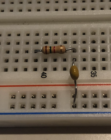
- Build the RC circuit on the breadboard.
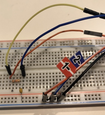
- Make the following connections between the DAD and the circuit:
- Connect the W1 function generator to the input. (Yellow wire in photo.)
- Connect the 1+ oscilloscope/meter lead to the input. (Orange wire in photo.)
- Connect the 2+ oscilloscope meter lead to the output. (Blue wire in photo.)
- Connect the 1-, 2-, and at least one of the other black ground leads to the circuit ground on the board.
- Set the frequency sweep parameters. In the Waveforms window, just above the upper graph set the following:
- Scale: Logarithmic. (The measurement frequencies will be space in a logarithmic fashion and the frequency axis will be logarithmic.)
- Start: 10 Hz. There is a drop down menu with some options or just type number in directly.
- Stop: 100 kHz. Obviously, the start and stop frequencies depend on the circuit. We want the range to extend through the "interesting" part of the frequency response without including too much of the "flat" areas.
- Then enter either the the total number of samples or the number of samples per decade. Whichever entry is made, the other will be calculated. For example, if we enter "Samples: 201", then the numer of samples per decade will 50. Or if we enter "/Decade: 50", the total number will be 201. It doesn't matter which is entered — the two parameters are coupled. Obviously, more samples will give a smoother curve, but with more samples, the total measurement time will be longer. (Usually, the time is not an issue since most measurements will be done in a minute or less.)
- Set the amplitude of the input sinusoid. The settings for the source are on the right side of the window, in the "Wavegen" block. Set the amplitude to a larger value — say 4 V for this measurement. The measurements will be more accurate for larger signals. However, we must be careful to ensure the output measurement will not clip, which would cause the voltage and phase measurement to be inaccurate. It is always good practice to check the waveforms during the measurement to ensure that the output is not clipping. (See "Viewing waveforms" in the "Frills" section below.)
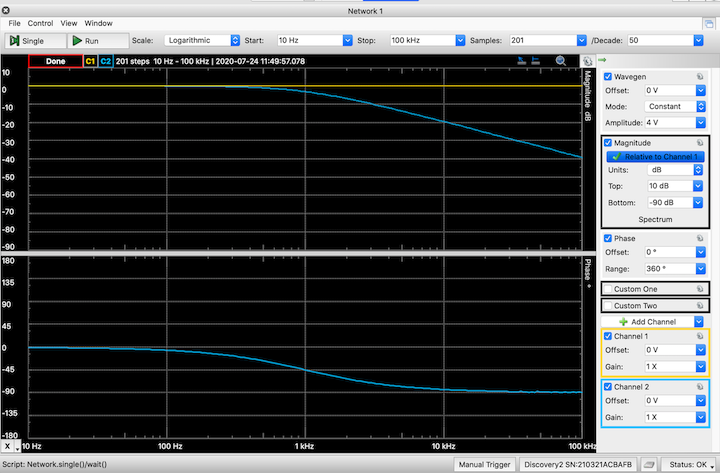
Generally, when doing frequency response measurements, no DC offset is required for the source, so leave it at 0 V. And the mode should be "Constant", meaning that the amplitude does not change with frequency. - Once everything is set and connected, we are ready for the measurement. Click the "Single" button at the upper left. A single measurement sweep commences. As the sweep progresses, the magnitude and phase curves will be plotted in the two graphs. At first, the measurements will progress slowly, but they will speed up at higher frequencies. Presumably, this is because it takes longer to collect enough waveforms to calculate the magnitude and phase at lower frequencies.
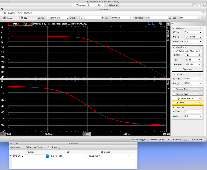
The "Run" button causes the sweeps to repeat continuously. Usually continuous sweeps are not necessary — one good sweep is sufficient. - That's it. An image of the initial sweep is shown below. The next section describes some further steps to extract specific data and enhance the graphs for better presentation.
Frills (But don't ignore.)
We can make some adjustments to the graphs. Also, there cursors and other features to help extract specific data and make sure that the measurements are reliable.
- Remove the curve for the source. While it is important to measure the source magnitude through the entire sweep to provide a baseline for the transfer function calculation, it usually is not necessary to include it in the magnitude plot. It can be turned off by unchecking the "Channel 1" item in the channel box at the lower right of the window.
- Trace color. While we are over here, if we want, we can change the color of the curves. Click the little "gear" icon in the Channel 2 box. A dialog opens. Click on the color box and choose a favorite new color. (We have chosen red in this example.)
- Adjusting scales. Usually, the default vertical scales will not be optimal for the magnitude or phase graphs — interesting features may be cut off or there may too much "wasted" space. The software is not as flexible as could it be for adjusting the graph details, but with a bit of trial-and-error, we can make the scales more suitable.
The vertical axis settings are changed using the controls in the "Magnitude" and "Phase" blocks on the right side of the window. The magnitude has upper and lower limits and the phase has a range and offset. (Don't ask me why there are two different methods for controlling the scales.) When we adjust the scales, it is important to note that the magnitude graph always has 10 divisions and the phase graph always has 8 divisions. (Again, no idea why there is a difference.)
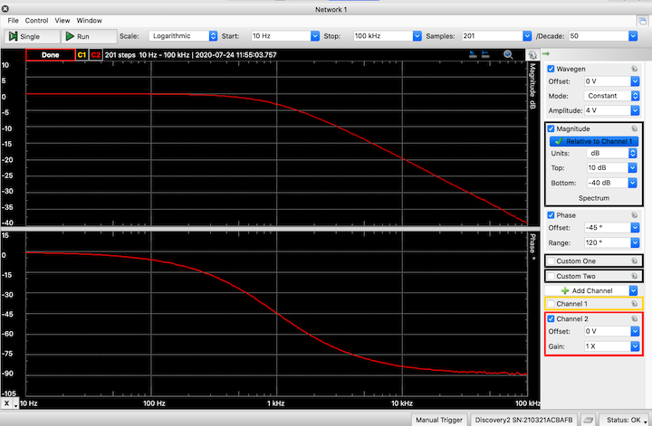
For this RC circuit, the measured magnitude curve ranges from 0 dB to -40 dB, so we might be inclined to set the upper limit at 5 dB and the lower limit at -50 dB. Then the range is 55 dB and so the scale would be 55 dB/10 = 5.5 dB per division. While not "wrong", the scaling is a bit awkward. So instead, we might try having the upper at 0 dB and the lower at -40 dB. Then the scale is a bit nicer at 4 dB/division, but the top portion of the curve is jammed up against the top of the graph — someone viewing the graph might be unsure if curve is flattened there or if it has gone off the scale. Iterating once more, we might settle for the option of the top at 10 dB and the bottom at -40 dB. This gives a nice scaling of 5 dB/division and the curve fits within the graph nicely through the entire range.
We can adjust the phase graph as well. The default range is +180° to -180°, but the measured phase changes by only 90°, leaving much of the graph "empty". To improve it, we can reduce the range — setting it to 120° gives a nice scaling of 15°/div while providing enough room to see the entire curve. However, the scale then extends from +60° to -60°, and the curve runs off the bottom of the graph. To correct it, we adjust the offset. In this case, we want the curve to move "up" in the graph, so we can introduce an offset of -45° (3 division) so that the -45° line is at the center of the graph.
Now the curves are completely visible, they cover most of the displayed range, and the vertical axis divisions are "nice".
- Zooming in. To better observe details in the curves, we can "zoom in" by reducing the frequency and vertical scale settings in order to focus on a particular piece of the curve. We can simply enter new values for frequency at the top and magnitude/phase on the right. Or we can use the scroll wheel. With the mouse cursor anywhere in the main part of the graph, spinning the scroll wheel changes the frequency-axis scaling. Moving the mouse cursor to the vertical-axis labels and spinning the scroll wheel adjusts the vertical scale. The scroll wheel method is fast, but trying to hit exact scaling values is tricky.
- Cursors. Vertical cursors can be added to the graph to help in extracting specific values for ωo, ωc , etc. Under the "View" menu at the top, choose "Cursors". A new window opens. (Initially, it looks like a pane within the graph window, but it is actually a separate window, which can be moved away from the graph window so that the graphs can "keep their space".)
To create a cursor, click on "+Normal" in the cursor window. (Or click on the "X" label in the lower left corner of the graph window.) The cursor shows up as a vertical line at some frequency. The first cursor is labeled "1", and subsequent cursors are labeled consecutively. It is possible to have many cursors. (I quit trying after 20.) In the cursor window, the cursor's frequency position and the corresponding magnitude and phase values of the curves are listed.
The cursor can be moved. Type in a new frequency value for the cursor in the cursor window. Or use the mouse to "click and hold" on the cursor label and move the cursor directly with the mouse.
The cursor color can be changed. Click on the little triangle in the cursor label. Choose "color" from the pop-up menu. (In this case, we chose green.) Also, the information presented in the cursor window can be changed. There are a number of items that show up as defaults when the cursor window is first opened, including lots of "deltas" that list horizontal or vertical differences. In some cases, those might all be useful, but often they just clutter up the cursor window. Use the "Show" menu in the cursor window to change the displayed items. In this case, we have selected to show only the frequency and the Channel 2 magnitude and phase.
An obvious application of the cursors is to find the corner frequency (or frequencies) or the center frequency of band-pass. This is easy to do. First move the cursor into the passband region of the magnitude curve and read the value of the peak magnitude. For this circuit, reading at 10 Hz, which is the lowest measured frequency, gives a magnitude of -0.007 dB (essentially 0 dB). Then move the cursor along the curve until hitting the point where the magnitude is -3 dB, we find the corresponding frequency to be 976 Hz, which is a bit lower than the expected 1060 Hz. This suggests that RC for the circuit is a bit bigger than expected. Indeed, when the resistor and capacitor are measured, RC = (1478 &Omega)(109 nF) = 0.161 msec, corresponding to a corner frequency of 988 Hz. This is within 2% of the measured value. We consider that to be pretty good. (Note: Instead of using one cursor and moving it around, you could use two cursors. Locate one at the peak and move the other to the point on the curve that is 3 dB down from the peak.)
To remove a cursor from the display, click and hold on the cursor label and then select "Remove" from the pop-up dialog. Or click on the red "negative" sign at the right side of the cursor window.
- Viewing waveforms. A particularly nice feature of frequency response measurements with the DAD is that input and output waveforms can be viewed at the same time that the frequency is being swept. This is helpful for making certain that the waveforms are not distorted by clipping or some other mechanism. (Distortion would throw off the magnitude and phase calculations.) Also, a split view is extremely useful for learning about frequency response. It allows us to see the changing relationships between the input and output sinusoids at each frequency. This view helps make clear what the frequency response curves are really telling us about the sinusoidal behavior.
To see waveforms, choose the "Time" item in the "View" menu. A new window opens — again it looks like a pane inside the main window, but it can be moved out and resized. If Channel 1 is off, turn it back on. (Check the "Channel 1" item in the channel box at the right side of the main window.) The waveform graph should display traces for both Channel 1 (input) and Channel 2 (output). In the main window, click "Single" to begin a frequency sweep. As the frequency sweeps and the frequency-response curves are mapped, the waveform graph displays the input and output sinusoids. The time base and triggering continuously change to show two periods of the waveforms. The input sinusoid should look the same throughout the sweep, while the output sinusoid changes amplitude and phase according to the dictates of the transfer function. Note that the waveform graph voltage scale can be changed using the "Gain" setting in the blocks for Channel 1 and Channel 2. (In the figures below, the gain is set to 1.25 for both channels.)
The sweep can be stopped at a specific step in order to observe or record the waveforms. Use the "pause, play, step forward, step back" controls at the top of the waveform window. These allow you to stop the sweep, step forward or backward to a particular frequency to record to view the waveforms, and then continue the sweep. (Do not use the "Stop" button in the frequency response window. That freezes everything and the step controls in the waveforms window will not work. Then clicking "Single" or "Run" will cause the sweep to start over.)
Note that you can only step to frequencies defined in the sweep set up. For instance, in the RC example, the corner frequency measured using the cursor was 976 Hz, but in the measurement sweep, the nearest frequency steps were 955 hz and 1 kHz. The frequency step closest to the measured corner is at 955 Hz and is shown in the figure below. (The current step frequency is displayed just above the magnitude graph and at the top of the waveform graph.) Also note that we must stop the sweep in middle and step forward or backward from the stopped frequency. If the sweep runs to the end, clicking on the "back" step icon will not work.
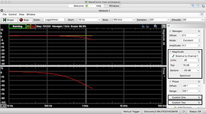
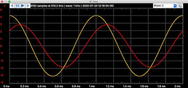
The top graphs show the the frequency sweep stopped at 950 Hz. The bottom graph shows the corresponding input (yellow) and output (red) waveforms. - Linear scale. If we don't like Bode plots, we can change to a linear scale for the magnitude. In the Magnitude block on the right side of the main window, change the "Units" to "gain (X)" (or "%" or "Vpeak" or "Vrms"). Be sure to adjust scales to make the graph look "good".
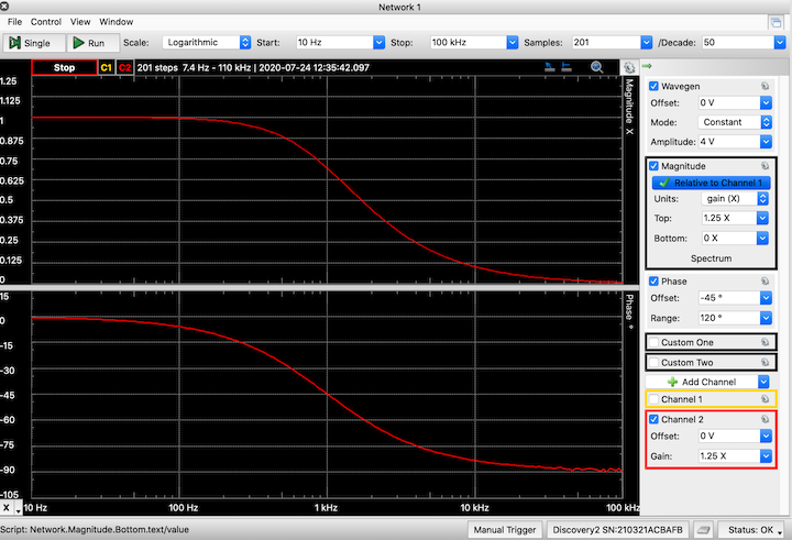
The frequency response with a linear scale for the magnitude plot. - Change the graph background Black backgrounds are nice for viewing graphs on a computer, but they are terrible for printing. If we plan to make paper print-outs of the plots, we should change the background before taking screenshots or whatever. To change the background, click on the little "gear" icon at the top right of the frequency-response or waveform graph. In the pop-up dialog, change the color from "Dark" to "Light". After changing the background, it might be necessary to change the trace colors as well.